Amazon Infographics Sell: Proven Design Principles for High-Converting Product Images

Amazon infographic design is something worth thinking about two sellers, same product, similar price. One is doing three times the volume. Nine times out of ten, the difference isn’t their keyword strategy. It’s the images.
Amazon shoppers don’t read first. They look. And if what they see doesn’t stop them within the first second or two, they’re already on the next listing. As an Amazon Ads Verified Partner, RootAMZ has seen this play out across hundreds of seller accounts categories ranging from kitchen tools to supplements to pet accessories. The listings that consistently outperform aren’t always the ones with the best products. They’re the ones with infographics that were built to do a job.
Here’s what that actually looks like in practice.
1. Open With the Customer’s Problem, Not Your Product
Most sellers put a product shot first. Makes sense, it’s your product, you’re proud of it. But from a shopper’s perspective, that image tells them nothing they couldn’t get from the dozen other listings around it.
What actually hooks attention is recognition. A shopper sees a leaking lid, tangled cables, a label that won’t peel clean and suddenly that listing is about them, not just the product. RootAMZ builds primary infographics around that emotional entry point. The product comes in as the resolution, not the introduction. It’s the core idea behind our Amazon Product Infographics work stop selling features, start solving something.
2. Structure the Image So the Eye Knows Where to Go
An infographic without a reading order is just noise. Shoppers especially on mobile, where most Amazon browsing now happens aren’t studying your image. They’re glancing at it. If there’s no clear visual path, they move on.
RootAMZ puts a hierarchy into every Infographic design: headline up top, product anchored at center, callouts placed with intention, and something at the base that earns trust before they scroll away. No guesswork about where to look. That same structural thinking goes into how we approach A+ Content, Premium A+ Content, and Brand Store Design at RootAMZ, the whole listing should feel like one argument, not separate pieces.
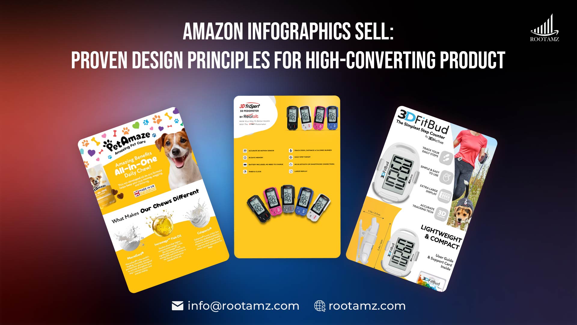
3. Call-outs Should Be Specific Enough to Be Believed
“Premium quality.” “Durable materials.” “Great for everyday use.” These phrases are everywhere. They also mean nothing.
What shoppers actually trust is a specific claim they can picture-“stitching rated to 40kg,” “fits bottles up to 3.5 inches wide,” “tested at -20°C.” RootAMZ writes call-outs with that level of precision, then pairs them with icons and arrows that make the image scannable rather than crowded. Less text on screen, but more information retained. Our Amazon Listing Optimisation service connects this to copy, so the bullets and the visuals reinforce each other rather than repeating the same line twice.
4. Brand Consistency Across Your Entire Image Set
Amazon gives sellers nine image slots. A lot of sellers treat each one separately. Different layouts, slightly different fonts, a colour that drifted two shades small things individually, but together they create this low-grade feeling of inconsistency that shoppers pick up on without knowing why.
RootAMZ designs image sets as a unit. Same typeface, same palette, same spacing logic across every frame. It matters more than most sellers expect brand familiarity builds during the swipe, and that familiarity is part of what pushes someone from browsing to buying. RootAMZ carries this same approach into Brand Story Creation and Brand Store Design, so the product page and the storefront feel like they belong to the same brand.
5. Design for the Thumbnail First
Before a shopper ever opens your listing, they see your main image small, in a grid, surrounded by competitors. That thumbnail is doing the heavy lifting, and it has almost no room to do it.
At RootAMZ, main image design starts with that constraint. Product filling most of the frame, background clean enough that nothing competes, zero text overlay cluttering the shot. Secondary Infographics design get a different treatment overlay text sized and weighted to stay legible even when Amazon compresses it for smaller placements. This matters a lot for sellers managing large catalogs across Seller Central and Vendor Central, which is a situation RootAMZ handles regularly.
6. Infographics Work Better Alongside Video and A+ Content
A strong image set gets clicks. It doesn’t always close the sale on its own. The listings that convert at the highest rates are the ones where the infographics, the product video, and the A+ or Premium A+ Content were designed to work together same message, different formats.
RootAMZ builds all three as a connected set, not separate deliverables. And this extends across platforms Walmart Product Infographics, Walmart Store Design, eBay Product Infographics, and eBay account management.
RootAMZ offers for sellers running multi-channel operations. Alongside creative, RootAMZ manages:
- Amazon PPC
- Amazon Account Health
- Amazon Seller Central Management
- Amazon Vendor Central management
So great-looking listings are backed by the traffic and operations that let them perform.
Final Thoughts
Good Infographics design aren’t about making your listing look impressive. They’re about removing the reasons a shopper might hesitate. Every design decision where the eye goes first, what the callout says, how the thumbnail reads at half an inch is a chance to answer a question before it gets asked.That’s the standard RootAMZ works to on every infographic, A+ module, and brand store. If your current listing images aren’t converting the way they should, visit rootamz.com and let’s fix that.
✅Ready to Boost Sales with High-Converting Product Images?
FAQ’s
How many infographic images should I have in my Amazon listing?
Six to eight works best a mix of lifestyle shots, callout infographics, size references, and a trust or comparison graphic gives shoppers everything they need to decide.
Can RootAMZ create infographics for Walmart and eBay listings as well?
Yes, RootAMZ designs product infographics for Amazon, Walmart, and eBay, which makes it straightforward for multi-channel sellers to stay visually consistent.
Does RootAMZ handle only design, or do they offer full Amazon account management too?
RootAMZ covers Infographic design, A+ Content, PPC, listing optimisation, and complete Seller and Vendor Central account management under one roof.
How does RootAMZ ensure infographics are aligned with Amazon's image guidelines?
The RootAMZ design team tracks Amazon's compliance and image policy updates continuously, so every infographic delivered is guideline-ready and built to perform from day one.